---
title: "Your Heart in Motion"
subtitle: "A Hands-On Introduction to Digital Biomarker Research"
author: "[Lauren Lederer](http://laurenlederer.com) and [BIG IDEAs Lab @ Duke](https://dunn.pratt.duke.edu/)"
date: 2026-08-26
categories: [wearables, ECG, digital biomarkers, teaching]
format:
html:
html-math-method: katex
toc: true
toc-depth: 3
code-fold: show
code-tools: true
code-overflow: wrap
fig-align: center
execute:
warning: false
message: false
jupyter: python3
---
::: {.callout-note}
## About this tutorial
The original workshop was written for the [Digital Biomarker Discovery Pipeline](https://www.dbdp.org/) and
the [BIG IDEAs Lab @ Duke](https://dunn.pratt.duke.edu/) for community engagement events. It can be adapted for students
and groups of all ages!
It walks from data collection to raw sensor output of two common data types in wearable research - accelerometer (movement) and electrocardiography (electrical activity of the heart)
:::
You are a digital biomarker researcher who studies health by analyzing signals collected
from wearable devices during everyday life. Outside the clinic, people walk, climb
stairs, laugh, feel stressed, get excited, and recover, and throughout all of this the
heart continuously adjusts to meet the body's needs. Your lab now uses the
**Polar H10**, a chest-worn wearable used in clinical research and elite athletics, to
capture physiology as it unfolds in real time.
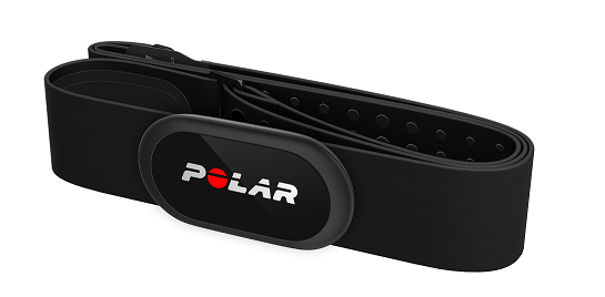
The Polar H10 records:
- raw ECG signals from each heartbeat
- tri-axial accelerometer data that tracks movement in three dimensions
- nanosecond-resolution timestamps that precisely align heart activity with motion
## The Case Study
**What happens to your heart when you start moving — and what happens after you stop?**
More specifically:
- Does your heart rate jump right away, or lag behind your movement?
- Does your heart calm down as fast as it sped up?
- Can we "see" activity just by looking at heart signals?
## Data Collection
### Option 1: Collect Your Own Data
#### Supplies
- Polar H10 Strap
- App to get raw data from the Polar -- the App Store Polar App will not work for this!! (I custom built one based off of the [Polar SDK](https://github.com/polarofficial/polar-ble-sdk/tree/master/examples/example-ios/polar-sensor-data-collector))
- Stopwatch and Paper/Excel - We use a synchronized clock such as [this one](https://www.freetools.org/time-tools/clock-with-nanoseconds) to keep the paper record aligned with the device.
#### Protocol
One volunteer wears the Polar H10 chest strap, snug and centered under the chest, and
recording starts before anything happens. The participant then moves through five
phases:
| Phase | What the participant does |
|---|---|
| 1. Baseline | Sits quietly |
| 2. Light activity | Walks at a comfortable pace |
| 3. Recovery | Sits back down |
| 4. Moderate/vigorous activity | Jumping jacks or running in place |
| 5. Final recovery | Sits back down |
A second person acts as **recorder**: they call each phase start and stop and write down
the exact wall-clock time in `HH:MM:SS`, 24-hour format.
::: {.callout-important}
## The recorder has the hardest job (accurate data labeling is so important!!)
The sensor has no idea what the participant is doing. Every claim in this tutorial about
"heart rate during walking" depends entirely on someone having written down when walking
started!
:::
The Polar App writes two whitespace-delimited text files, `ECG.txt` and `ACC.txt`.
### Option 2: Sample Data
Everything below runs on three files. Download them into a `data/` folder next to the
notebook, or clone the repository and they are already in place.
<a href="data/ECG.txt" download>ECG.txt</a> · <a href="data/ACC.txt" download>ACC.txt</a> · <a href="data/timetracker.csv" download>timetracker.csv</a>
**`ECG.txt`** — 127,093 samples at 130 Hz, whitespace-delimited, one header row.
| Column | Meaning |
|---|---|
| `TIMESTAMP` | Nanoseconds since 2000-01-01 00:00:00 UTC (the Polar epoch, not the Unix epoch) |
| `ECG(microV)` | Single-lead ECG amplitude in microvolts |
**`ACC.txt`** — 24,624 samples at 25 Hz, same format.
| Column | Meaning |
|---|---|
| `TIMESTAMP` | As above |
| `X(mg)`, `Y(mg)`, `Z(mg)` | Acceleration per axis in milli-g; a stationary strap reads ~1000 mg total because of gravity |
**`timetracker.csv`** — the recorder's phase log, five rows.
| Column | Meaning |
|---|---|
| `phase` | Protocol phase, numbered so it sorts chronologically |
| `start_time`, `end_time` | Local wall clock (`America/New_York`), no timezone attached — this is what the recorder wrote down |
| `duration_seconds` | Convenience column, derived |
If the app reports a dropped stream it appends an `ERROR` line to the end of the file.
There are none in this recording, but `load_polar_file` checks anyway.
# Setup the code
The code and functions below get us started in processing the incoming data files from the Polar strap and our timestamps.
```{python}
#| label: setup
import numpy as np
import pandas as pd
import matplotlib.pyplot as plt
import plotly.express as px
import plotly.graph_objects as go
from plotly.subplots import make_subplots
import neurokit2 as nk
from datetime import datetime, timezone

plt.rcParams.update({"figure.figsize": (8, 4.5), "figure.dpi": 130,
                     "axes.spines.top": False, "axes.spines.right": False})
```
```{python}
#| label: config
# --- Recording configuration -------------------------------------------------
ECG_FILE = "data/ECG.txt"
ACC_FILE = "data/ACC.txt"
PHASE_FILE = "data/timetracker.csv"

# Timezone the recorder's wall clock was in. The device writes UTC; the paper
# record is local time. Getting this wrong silently labels everything "Unknown".
LOCAL_TZ = "America/New_York"

ECG_FS = 130   # Hz, Polar H10 ECG stream
ACC_FS = 25    # Hz, confirmed from the timestamps below

# Seconds of smoothing applied to instantaneous heart rate. Must be short
# relative to your shortest phase, or you will smooth away the thing you
# are trying to measure.
HR_SMOOTH_SEC = 10

# Minimum NeuroKit signal-quality score for a beat to count toward heart rate.
ECG_QUALITY_MIN = 0.90
```
## Helper functions
These four functions handle the unglamorous part: turning device timestamps into real
clock times, reading the files, and attaching phase labels.
```{python}
#| label: helpers-load
#| code-fold: true
#| code-summary: "Loading and timestamp resolution"
def resolve_timestamps(df, local_tz=LOCAL_TZ):
    """Convert Polar nanosecond timestamps (epoch 2000-01-01 UTC) to local wall
    clock, then drop the timezone so the values compare directly against the
    recorder's paper log."""
    polar_epoch = datetime(2000, 1, 1, tzinfo=timezone.utc)
    unix_epoch = datetime(1970, 1, 1, tzinfo=timezone.utc)
    offset_ns = int((polar_epoch - unix_epoch).total_seconds() * 1e9)

    df = df.copy()
    df["Timestamp"] = (
        pd.to_datetime(df["raw_time"] + offset_ns, unit="ns", utc=True)
          .dt.tz_convert(local_tz)
          .dt.tz_localize(None)
    )
    return df.drop(columns=["raw_time"])


def load_polar_file(path, value_cols):
    """Read a Polar text export. Returns (dataframe, list_of_device_errors).

    The app appends an ERROR line if the stream drops, so we look for those
    rather than assuming the file is clean."""
    df = pd.read_csv(path, sep=r"\s+", skiprows=1, header=None,
                     names=["raw_time"] + value_cols, engine="python")

    is_error = df["raw_time"].astype(str).str.contains("ERROR", case=False, na=False)
    errors = df.loc[is_error, "raw_time"].astype(str).tolist()
    df = df[~is_error]

    for col in ["raw_time"] + value_cols:
        df[col] = pd.to_numeric(df[col], errors="coerce")
    df = df.dropna(subset=["raw_time"] + value_cols)

    return resolve_timestamps(df), errors


def report_sampling_rate(df, name):
    dt_ms = df["Timestamp"].diff().dt.total_seconds().median() * 1000
    print(f"{name}: {len(df):>7,} samples | "
          f"{df.Timestamp.min():%H:%M:%S} to {df.Timestamp.max():%H:%M:%S} | "
          f"median interval {dt_ms:.2f} ms ({1000/dt_ms:.1f} Hz)")
```
```{python}
#| label: helpers-label
#| code-fold: true
#| code-summary: "Phase labelling"
def label_by_phase(df, event_df, unknown_label="Unknown"):
    """Tag every sample with the phase whose window contains it."""
    out = df.copy()
    out["activity"] = unknown_label
    for _, evt in event_df.iterrows():
        in_window = (out["Timestamp"] >= evt["start_time"]) & (out["Timestamp"] <= evt["end_time"])
        out.loc[in_window, "activity"] = evt["phase"]
    return out


def collect_phase_times(phases, date=None):
    """Interactive entry of the recorder's paper log. Used live in the workshop;
    the published version reads the saved CSV instead."""
    date = date or datetime.today().strftime("%Y-%m-%d")
    records = []
    print("\nManual phase time entry — enter times as HH:MM:SS\n")
    for phase in phases:
        while True:
            try:
                start_dt = datetime.strptime(f"{date} {input(f'Start of {phase}: ')}", "%Y-%m-%d %H:%M:%S")
                end_dt = datetime.strptime(f"{date} {input(f'End of   {phase}: ')}", "%Y-%m-%d %H:%M:%S")
                if end_dt <= start_dt:
                    raise ValueError("End time must be after start time.")
                records.append({"phase": phase, "start_time": start_dt, "end_time": end_dt,
                                "duration_seconds": (end_dt - start_dt).total_seconds()})
                break
            except ValueError as err:
                print(f"  Invalid input: {err}. Try again.\n")
    return pd.DataFrame(records)
```
# Log Timestamps
During the workshop this cell is run live, right after the protocol finishes, and the
recorder reads their times off the paper log:
```{python}
#| eval: false
phases = ["1_Baseline", "2_Light activity", "3_Recovery",
          "4_Moderate/vigorous activity", "5_Final recovery"]

event_df = collect_phase_times(phases)
event_df.to_csv(PHASE_FILE, index=False)
```
For this published version we read the saved timestap log (`timestamp.csv`) instead:
```{python}
#| label: tbl-phases
#| tbl-cap: "Phase log for the recording in `data/`"
event_df = pd.read_csv(PHASE_FILE, parse_dates=["start_time", "end_time"])
event_df
```
# Data Exploration
## Load the Polar Files (ACC and ECG)
```{python}
#| label: load
ecg_df, ecg_errors = load_polar_file(ECG_FILE, ["ECG"])
acc_df, acc_errors = load_polar_file(ACC_FILE, ["X", "Y", "Z"])

report_sampling_rate(ecg_df, "ECG")
report_sampling_rate(acc_df, "ACC")

device_errors = ecg_errors + acc_errors
print(f"\nDevice-reported errors: {device_errors if device_errors else 'none'}")
```
Two things worth checking every single time you load a recording:
**Does the sampling rate match what you configured?** The ECG stream is 130 Hz as
expected. The accelerometer is 25 Hz here.
**Does the clock look right?** The recording should land in the same part of the day your
paper log does. Here the device wrote 13:00 UTC and the recorder wrote 08:00, and the two
line up once you convert. If these don't line up, it's usually a timezone matching issue.
## 2.2 Attach phase labels
```{python}
#| label: relabel
acc_labeled = label_by_phase(acc_df, event_df)
ecg_labeled = label_by_phase(ecg_df, event_df)

coverage = (acc_labeled.activity != "Unknown").mean()
print(f"Accelerometer samples falling inside a labelled phase: {coverage:.1%}")
print(acc_labeled.activity.value_counts().to_string())
```
## 2.3 What do the raw signals look like?
Here is the whole recording. The toggle in the top right shades the five phases.
```{python}
#| label: helpers-plot
#| code-fold: true
#| code-summary: "Overview plot"
# Hex so the same palette works in both Plotly and Matplotlib.
PHASE_COLORS = ["#66c2a5", "#fc8d62", "#8da0cb", "#e78ac3", "#a6d854", "#ffd92f"]

def plot_ecg_acc_with_phase_toggle(df, event_df, ecg_col="ECG_Clean",
                                   decimate=4, height=650):
    """Two stacked panels — accelerometer and ECG — with a show/hide phase overlay.

    `decimate` thins the traces before they are serialized into the page. At full
    resolution this figure is several megabytes of JSON."""
    d = df.iloc[::decimate]

    fig = make_subplots(rows=2, cols=1, shared_xaxes=True, vertical_spacing=0.07,
                        subplot_titles=("Accelerometer (X, Y, Z)", "ECG (cleaned)"))

    for col in ("X", "Y", "Z"):
        fig.add_trace(go.Scattergl(x=d.Timestamp, y=d[col], mode="lines",
                                   name=f"ACC {col}", opacity=0.75), row=1, col=1)

    fig.add_trace(go.Scattergl(x=d.Timestamp, y=d[ecg_col], mode="lines",
                               name="ECG", line=dict(color="#222")), row=2, col=1)

    shapes, annotations = [], []
    for i, r in event_df.reset_index(drop=True).iterrows():
        colour = PHASE_COLORS[i % len(PHASE_COLORS)]
        shapes.append(dict(type="rect", xref="x", yref="paper",
                           x0=r.start_time, x1=r.end_time, y0=0, y1=1,
                           fillcolor=colour, opacity=0.18,
                           line=dict(width=0), layer="below"))
        annotations.append(dict(x=r.start_time + (r.end_time - r.start_time) / 2,
                                xref="x", y=1.0, yref="paper", text=r.phase,
                                showarrow=False, font=dict(size=10),
                                bgcolor="rgba(255,255,255,0.75)"))

    fig.update_layout(
        shapes=shapes, annotations=annotations,
        height=height, hovermode="x unified",
        margin=dict(t=90, b=40, l=60, r=20),
        legend=dict(orientation="h", yanchor="bottom", y=1.06, xanchor="right", x=1),
        updatemenus=[dict(type="buttons", direction="left", showactive=True,
                          x=0.99, y=1.12, xanchor="right", yanchor="bottom",
                          buttons=[
                              dict(label="Hide phases", method="relayout",
                                   args=[{"shapes": [], "annotations": []}]),
                              dict(label="Show phases", method="relayout",
                                   args=[{"shapes": shapes, "annotations": annotations}]),
                          ])])
    fig.update_yaxes(title_text="mg", row=1, col=1)
    fig.update_yaxes(title_text="µV", row=2, col=1)
    return fig
```
# Building the digital biomarkers
## Accelerometer → movement intensity
The most common transformation is the vector magnitude:
$$
\mathrm{ACC}_{\mathrm{mag}} = \sqrt{x^2 + y^2 + z^2}
$$
This turns three-dimensional motion into one number per time point.
There is a wrinkle. The sensor measures gravity too, so a completely stationary strap
still reads about 1000 mg. What actually distinguishes sitting from jumping is not the
magnitude but how much it *varies*, so we take the rolling standard deviation of the
magnitude over a one-second window.
```{python}
#| label: acc-biomarker
acc_labeled["ACC_Magnitude"] = np.sqrt(
    acc_labeled.X**2 + acc_labeled.Y**2 + acc_labeled.Z**2
)

# Movement = variability in magnitude, not magnitude itself (gravity is ~1000 mg).
acc_labeled["ActivityIntensity"] = (
    acc_labeled["ACC_Magnitude"]
    .rolling(ACC_FS, min_periods=1, center=True)
    .std()
    .fillna(0)
)

print(acc_labeled.groupby("activity")["ACC_Magnitude"].mean().round(0).to_string())
```
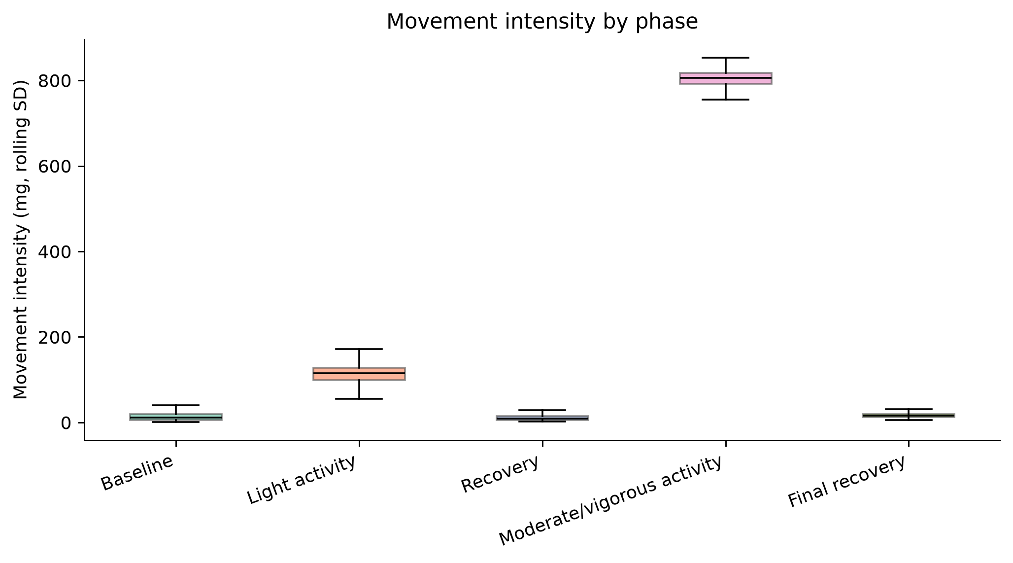
Notice how little the raw magnitude separates the phases — it hovers near 1000 mg
throughout, because gravity dominates. The variability measure is what carries the
signal.
## ECG → Heart Rate
Getting from a voltage trace to beats per minute takes four steps:
1. **Detect the R-peaks.** An ECG measures the electrical activity of the heart as it
contracts. The most prominent feature is the R-peak, the tall spike. We filter the
signal to remove noise and baseline drift, then run a peak-finding algorithm.
2. **Compute RR intervals**, the time between consecutive beats: $RR_i = t_{i+1} - t_i$
3. **Convert to beats per minute**: $\text{HR} = 60 / RR$
4. **Smooth.** Real heart rate fluctuates beat to beat, influenced by breathing, posture,
and movement.
```{python}
#| label: helpers-ecg
#| code-fold: true
#| code-summary: "ECG processing"
def process_ecg(ecg_labeled, fs=ECG_FS, quality_min=ECG_QUALITY_MIN,
                smooth_sec=HR_SMOOTH_SEC):
    """Run NeuroKit's ECG pipeline and return a per-sample frame with cleaned
    signal, quality score, R-peak flags and smoothed heart rate."""
    raw = ecg_labeled["ECG"].to_numpy()
    signals, info = nk.ecg_process(raw, sampling_rate=fs, method="neurokit")

    # Discard heart-rate estimates from stretches the quality index distrusts,
    # then smooth what survives.
    rate = signals["ECG_Rate"].where(signals["ECG_Quality"] > quality_min)
    rate = rate.rolling(int(fs * smooth_sec), min_periods=1, center=True).mean()

    r_peaks = np.zeros(len(raw), dtype=int)
    r_peaks[info["ECG_R_Peaks"]] = 1

    return pd.DataFrame({
        "Timestamp": ecg_labeled["Timestamp"].values,
        "activity": ecg_labeled["activity"].values,
        "ECG_Clean": signals["ECG_Clean"].values,
        "ECG_Quality": signals["ECG_Quality"].values,
        "R_Peaks": r_peaks,
        "ECG_HeartRate": rate.values,
    }), info
```
```{python}
#| label: ecg-process
ecg_hr, ecg_info = process_ecg(ecg_labeled)

n_beats = int(ecg_hr.R_Peaks.sum())
duration_min = (ecg_hr.Timestamp.max() - ecg_hr.Timestamp.min()).total_seconds() / 60
usable = (ecg_hr.ECG_Quality > ECG_QUALITY_MIN).mean()

print(f"Detected beats:        {n_beats:,} over {duration_min:.1f} min "
      f"({n_beats/duration_min:.1f} beats/min average)")
print(f"Samples above the quality threshold: {usable:.1%}")
```
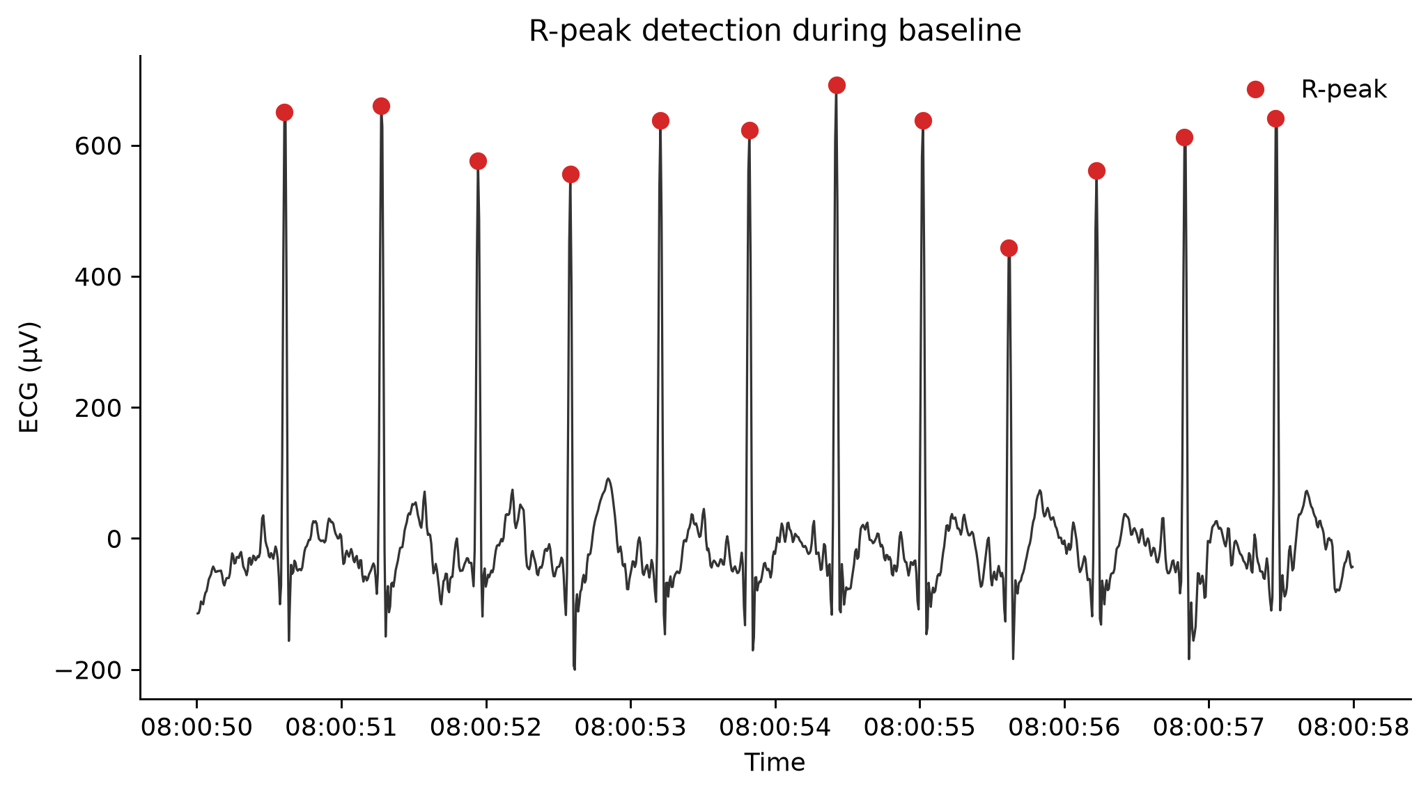
### Does the peak detection actually work?
Before trusting a single downstream number, look at the beats. Here are eight seconds
from the baseline phase with the detected R-peaks marked.
```{python}
#| label: fig-rpeaks
#| fig-cap: "Eight seconds of cleaned ECG with detected R-peaks. Every spike should have exactly one marker."
baseline_start = event_df.loc[event_df.phase.str.startswith("1"), "start_time"].iloc[0]
window = ecg_hr[(ecg_hr.Timestamp >= baseline_start + pd.Timedelta(seconds=30)) &
                (ecg_hr.Timestamp <= baseline_start + pd.Timedelta(seconds=38))]
beats = window[window.R_Peaks == 1]

fig, ax = plt.subplots()
ax.plot(window.Timestamp, window.ECG_Clean, lw=0.9, color="#333")
ax.plot(beats.Timestamp, beats.ECG_Clean, "o", ms=6, color="#d62728", label="R-peak")
ax.set_ylabel("ECG (µV)"); ax.set_xlabel("Time")
ax.legend(frameon=False)
ax.set_title("R-peak detection during baseline")
plt.tight_layout(); plt.show()
```
::: {.callout-tip}
## This is the check people skip
If a marker sits on a T-wave, or a spike has no marker, every heart rate number after
this point is wrong. Run this same plot on a window from the vigorous-activity phase —
motion artifact is much worse there, and it is where detection usually breaks first.
:::
## Align the two streams
The accelerometer runs at 25 Hz and the ECG at 130 Hz. `merge_asof` matches each
accelerometer sample to the nearest ECG sample in time, giving one tidy frame at the
slower rate.
```{python}
#| label: merge
acc_labeled = acc_labeled.sort_values("Timestamp")
ecg_hr = ecg_hr.sort_values("Timestamp")

labeled = pd.merge_asof(
    acc_labeled.drop(columns=["activity"]),
    ecg_hr,
    on="Timestamp",
    direction="nearest",
    tolerance=pd.Timedelta("50ms"),
)
labeled = labeled[labeled.activity != "Unknown"].dropna(subset=["ECG_HeartRate"])

PHASE_ORDER = sorted(labeled.activity.unique())
print(f"{len(labeled):,} aligned samples across {len(PHASE_ORDER)} phases")
```
```{python}
#| label: fig-overview
#| fig-cap: "The full recording. Use the toggle to show or hide the phase shading."
plot_ecg_acc_with_phase_toggle(labeled, event_df)
```
# What do the data tell us?
```{python}
#| label: helpers-box
#| code-fold: true
#| code-summary: "Boxplot helper"
def phase_boxplot(df, column, ylabel, title, order=None):
    order = order or PHASE_ORDER
    data = [df.loc[df.activity == p, column].dropna().values for p in order]
    fig, ax = plt.subplots(figsize=(8, 4.5))
    bp = ax.boxplot(data, patch_artist=True, showfliers=False,
                    medianprops=dict(color="black"))
    ax.set_xticks(range(1, len(order) + 1))
    ax.set_xticklabels([p.split("_", 1)[1] for p in order])
    for patch, colour in zip(bp["boxes"], PHASE_COLORS):
        patch.set_facecolor(colour); patch.set_alpha(0.65); patch.set_edgecolor("#555")
    ax.set_ylabel(ylabel); ax.set_title(title)
    plt.setp(ax.get_xticklabels(), rotation=20, ha="right")
    plt.tight_layout(); plt.show()
```
```{python}
#| label: fig-acc-box
#| fig-cap: "Movement intensity by phase."
phase_boxplot(labeled, "ActivityIntensity",
              "Movement intensity (mg, rolling SD)",
              "Movement intensity by phase")

labeled.groupby("activity").ActivityIntensity.describe().round(1)
```
```{python}
#| label: fig-hr-box
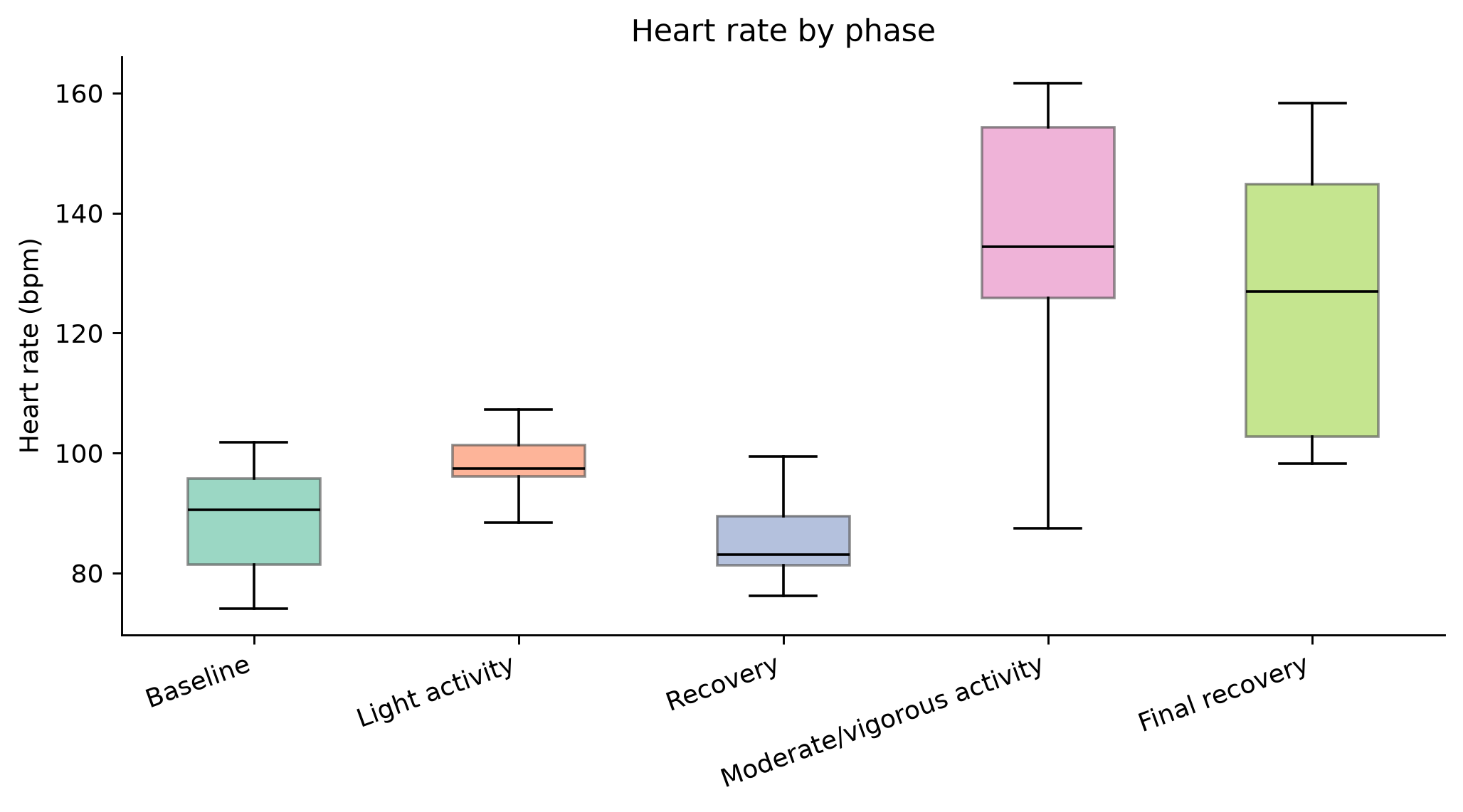
#| fig-cap: "Heart rate by phase."
phase_boxplot(labeled, "ECG_HeartRate",
              "Heart rate (bpm)",
              "Heart rate by phase")

labeled.groupby("activity").ECG_HeartRate.describe().round(1)
```
## Movement and heart rate, side by side
```{python}
#| label: helpers-timeline
#| code-fold: true
#| code-summary: "Timeline plot"
def plot_activity_and_hr(df, decimate=3, height=620):
    d = df.iloc[::decimate]
    colour_map = {p: PHASE_COLORS[i % len(PHASE_COLORS)] for i, p in enumerate(PHASE_ORDER)}

    fig = make_subplots(rows=2, cols=1, shared_xaxes=True, vertical_spacing=0.08,
                        subplot_titles=("Movement intensity", "Heart rate"))

    seg_id = (d.activity != d.activity.shift()).cumsum()
    for _, seg in d.groupby(seg_id):
        phase = seg.activity.iloc[0]
        fig.add_trace(go.Scattergl(x=seg.Timestamp, y=seg.ActivityIntensity, mode="lines",
                                   line=dict(color=colour_map[phase], width=1.4),
                                   name=phase, legendgroup=phase,
                                   showlegend=phase not in [t.name for t in fig.data]),
                      row=1, col=1)
        fig.add_trace(go.Scattergl(x=seg.Timestamp, y=seg.ECG_HeartRate, mode="lines",
                                   line=dict(color=colour_map[phase], width=2),
                                   name=phase, legendgroup=phase, showlegend=False),
                      row=2, col=1)

    fig.update_layout(height=height, hovermode="x unified",
                      margin=dict(t=80, b=40, l=60, r=20),
                      legend=dict(orientation="h", yanchor="bottom", y=1.04,
                                  xanchor="right", x=1))
    fig.update_yaxes(title_text="mg (rolling SD)", row=1, col=1)
    fig.update_yaxes(title_text="bpm", row=2, col=1)
    return fig
```
#### We can start by looking at a summary of the data in a table...
```{python}
#| label: tbl-summary
#| tbl-cap: "Mean movement intensity and heart rate by phase."
summary = (labeled.groupby("activity")
                  .agg(movement=("ActivityIntensity", "mean"),
                       heart_rate=("ECG_HeartRate", "mean"),
                       hr_start=("ECG_HeartRate", "first"),
                       hr_end=("ECG_HeartRate", "last"))
                  .round(1)
                  .reindex(PHASE_ORDER))
summary
```
#### But visually analyzing the data gives us a better sense for what's happening throughout the study!
```{python}
#| label: fig-timeline
#| fig-cap: "Movement intensity (top) and heart rate (bottom) over the full protocol, coloured by phase."
plot_activity_and_hr(labeled)
```
# Questions to Consider!
**Does heart rate jump right away when movement occurs?**
::: {.callout-note collapse="true"}
## Click to reveal the answer
Look at the timeline figure
at the start of the vigorous phase. Movement intensity goes from near-zero to maximum
within a single sample — the accelerometer responds instantly, because it is measuring
mechanics. Heart rate takes tens of seconds to climb, because it is measuring a
control system responding to demand.
:::
**Does heart rate calm down as fast as it sped up?**
::: {.callout-note collapse="true"}
## Click to reveal the answer
No, and this is the most interesting
result in the recording. Compare the vigorous phase to the final recovery in the table
above: the participant has stopped moving entirely, movement intensity is back to
baseline, and heart rate is still far above where it started. The asymmetry between how
fast heart rate rises and how slowly it falls is itself a biomarker — heart rate recovery
is used clinically as an index of autonomic function and cardiovascular fitness.
:::
**Can we "see" activity just by looking at heart signals?**
::: {.callout-note collapse="true"}
## Click to reveal the answer
Partly. The vigorous phase is
obvious from heart rate alone. Light walking is much less distinct — and the recovery
periods look, from heart rate alone, like activity that hasn't happened yet or has just
finished. Without the accelerometer you could not tell an elevated heart rate from
exertion apart from one caused by stress, caffeine, or a fever. This is the whole argument
for multimodal sensing.
:::
# Next Steps and Future Directions
Below are some ideas on how you can alter the code and experiment with the data.
- **Change `HR_SMOOTH_SEC`** to 1, then to 60, and re-render. At 60 seconds the recovery
dynamics disappear entirely. Smoothing windows are not cosmetic choices.
- **Lower `ECG_QUALITY_MIN`** to 0.5 and see how many more samples survive — and whether
the heart rate curve starts showing physiologically impossible jumps.
- **Plot the R-peak check figure during the vigorous phase** instead of baseline. Motion
artifact is worst exactly when the signal matters most.
- **Compute heart rate recovery properly**: the drop in bpm over the first 60 seconds
after exercise stops. Compare it to published reference ranges.
- **Try RR-interval variability** (`ecg_info["ECG_R_Peaks"]` gives you the beat indices).
HRV behaves very differently from mean heart rate across these phases.
::: {.callout-note}
## Data and reuse
If you use this material in a class
or workshop, attribution is appreciated. Developed with the BIG IDEAs
Lab Community Engagement Team at Duke University.
:::