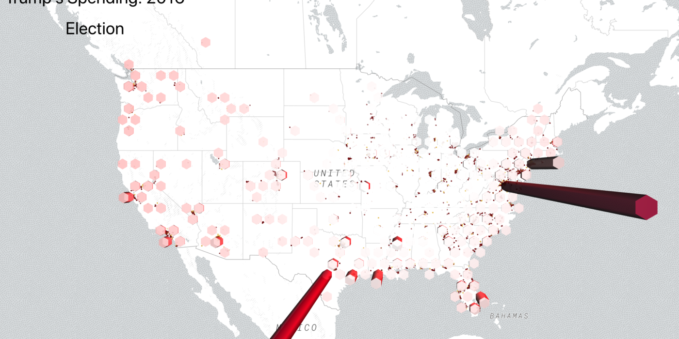
This web app is an interactive visualization of Trump’s FEC 2016 campaign spending data. It allows you to view and analyze how and where the Trump campaign spent election funds. You can adjust the parameters of the map and click on a cylinder to view individual purchases in a particular region. Although more difficult on a laptop, you can also tilt the angle of the map to better view some of the custom graphics and lighting.
Problem Definition
This project was initially built for my Computer Graphics class’ final project. The problem statement was open, but we had to demonstrate our ability to implement custom graphics components like shaders and materials. I wanted to create an interesting data visualization where I could extend a base-library with custom graphics classes.
While searching for interesting data sets, I came across the FEC website, which offers relatively clean CSV files of election data. With the surrounding uncertainty around the Trump campaign, I thought it would be interesting to analyze how and where his election money was spent.
Data Preparation
Before preparing the data, I already had an idea of how and what I wanted to visualize. I found and learned how to use a a library called Deck.GL. I then knew that I needed to have a latitude and longitude value for each FEC spending line-item if I wanted to show this data on a map.
I used Python to explore the dataset, clean out unedited rows, and I built a short script to convert each zipcode into LAT and LONG utilizing the opendatasoft api.
Visualizing the Data
Now that the data was ready, I got to work on creating an interactive map that can properly display this data. I added more advanced features like the sidebar that shows each individual election purchase. Because this web app is also built on React, I had to work on carefully piping the correct data to the right component without crashing the app.


